


Yale University Press | The Josef and Anni Albers Foundation
Covers
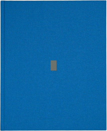
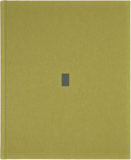
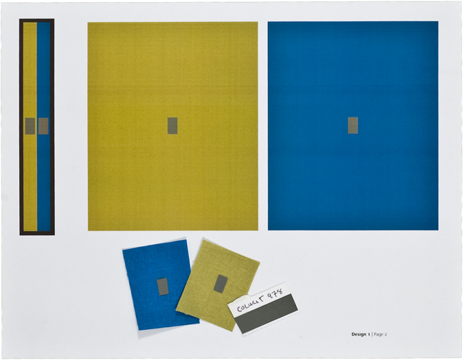
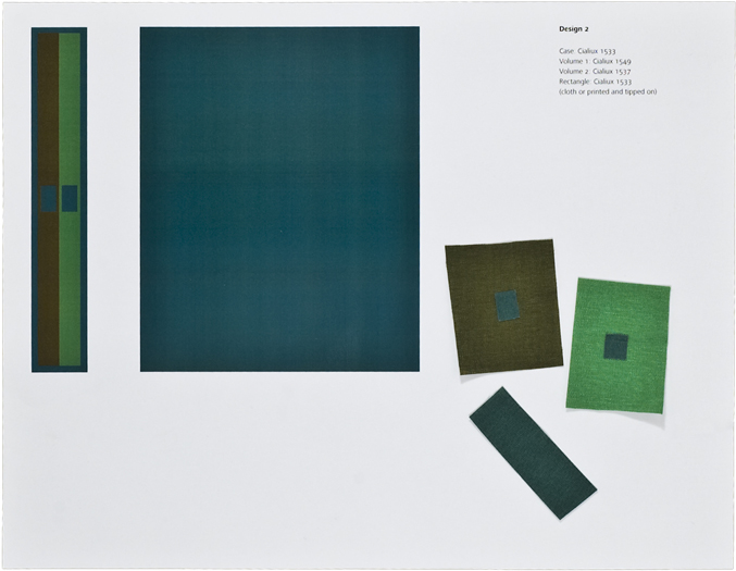
This two-volume set replicates the 1963 original Interaction of Color. However, the publisher wanted the covers to be a contemporary and enticing new addition. Albers and his students used colored paper sets that contained hundreds of colors. Albers preferred this to paint because the color was available instantly and not subject to the variations of paint. He encouraged the use of cutouts from magazines, wallpaper, paint samples, wrapping and bag papers, and waste strips from printers and bookbinders. Using Albers’s approach, I created the new covers through experimentation with materials available for the bookbinding process: foil stamping on cloth or cloth inset into cloth. My working palette was limited to about thirty colors of Assuan and Cialiux cloth and the explorations confined to tiny pieces clipped from swatch books. In the introduction to this book Albers writes, “color deceives continually.” It was remarkable to see the many “deceptions” I discovered within these limitations. For example, despite appearances, the rectangles on these final yellow and blue covers are stamped with the same gray foil.
Index | Next Book